Case Study 2
Quiet Lightning: A Literary UX Makeover
Local writers reading original works live!
(how is that supposed to compete when Hamilton is down the street?!?)

The Backstory
Quiet Lightning is a San Francisco Bay Area non-profit organization that produces a traveling monthly literary series with a no-frills twist. Authors submit their works anonymously, at no more than 1500 words (or 8 minutes, if you read allegro). Those selected commit to presenting their work live, also anonymously.
Since 2009, Quiet Lightning has produced more than 100 shows across 70 venues, from dive bars and art galleries to state parks and national landmarks. It has presented 1,100 readings by 700 authors, and published 80 books. It also maintains the most comprehensive literary event calendar in the SF Bay Area.
Quiet Lightning is primarily funded by a grant from the SF Arts Commission.

The Challenge:
You Get What You Pay For
Quiet Lightning is an entirely volunteer-run organization, and the bootstrapping shows in the website. It's virtually unnavigable. It isn't built for social or mobile. Visually, it's...unfortunate-looking.
Literature in San Francisco defines cool. This is Kerouac and Ginsberg, Twain, Steinbeck, Jack London. COOL. Passionate deliveries in dark dive bars. COOL. Quiet Lightning is cool!
But their website delivered zero cool. It wasn't pretty, and it actually diverted users away from prime content. In a town that averages 40+ significant events competing per night, Quiet Lightning needed help producing an experience that built Anticipation, maximized the Happening, and elongated the Reliving of their can't-miss events.
DISCOVERY: Planning, Research & Get Smart Exercises
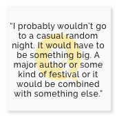
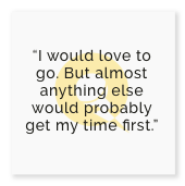
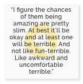
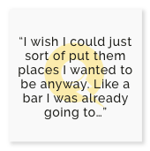
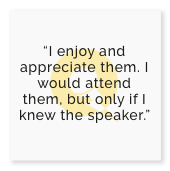
“In general, I haven’t been attracted to them [literary events]. However, I attended one as part of a music festival and was really blown away by the poetry. I didn’t realize it could be so modern and relatable. So, perhaps I just needed the prompt somehow... because now I would be open.”
I live in Quiet Lightning's community. I've worked for years in both the nightlife industry and in non-profit community organizing. I'm an avid reader and volunteer for an annual literary festival. So the challenge here wasn't learning the client, but holding biases and assumptions in check. I've had experiences with overthinking a project...now I had to make sure I thought enough.
User Surveys
However, as I moved through user research, I found that many of the my initial assumptions were reinforced. People had trouble navigating the site's information, they didn't receive the most important key messages, and they disliked the visual design.
But maybe more importantly, I learned user perceptions toward literary events as a whole.
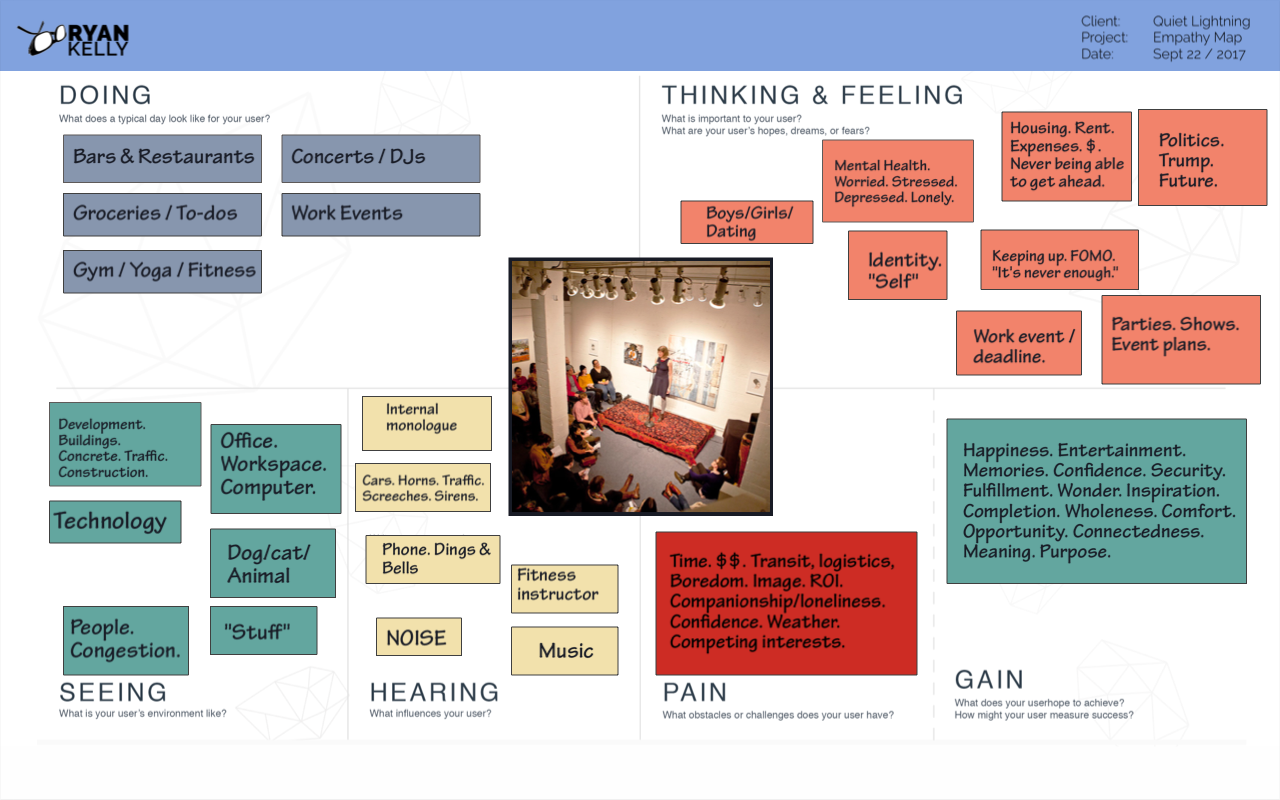
The Persona
User insights showed that people wanted to do magical things with their time, and among the factors that made an event magical, the most critical was having your favorite people with you. Users crave connection and community:
- They are less likely to go to events on their own.
- They are less likely to try new things alone.
- They are less likely to suggest unproven events to friends.
- They are more likely to attend an unknown event upon a friend's suggestion or invitation.

DEFINING: Information Sorting, Mapping & Architecture
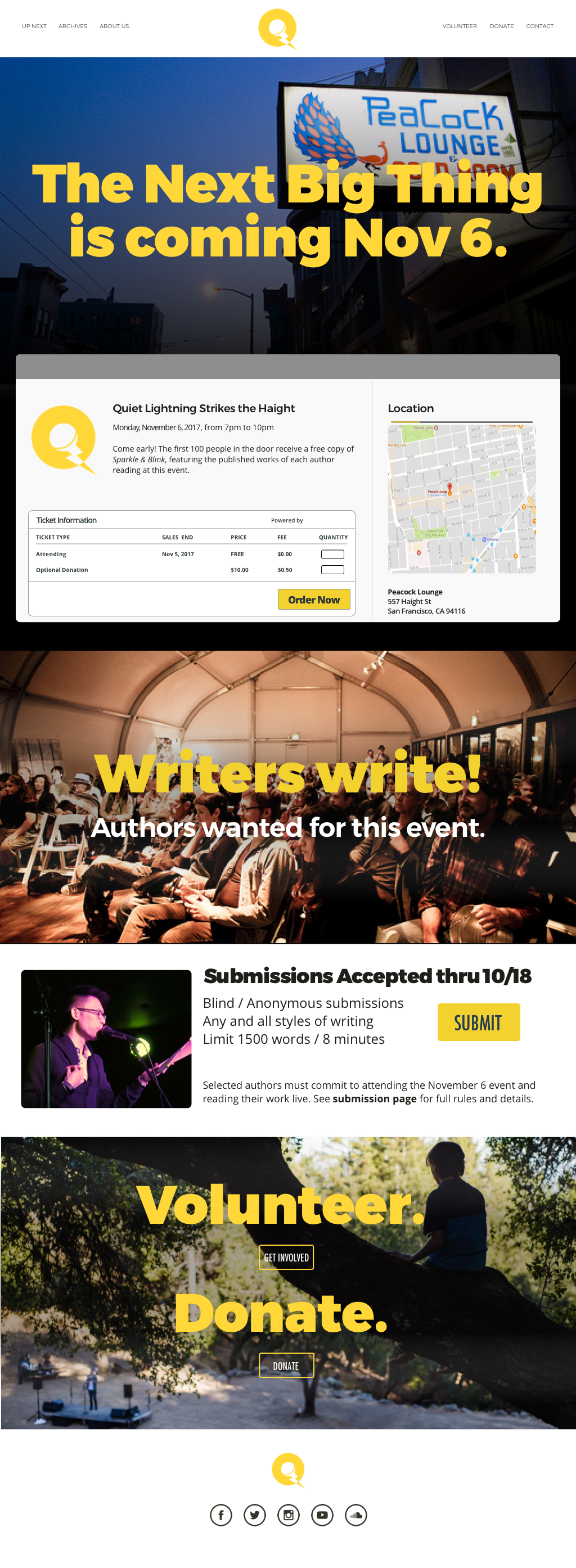
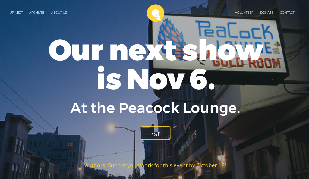
My solution was to reorganize the new Quiet Lightning site with the purpose of perpetuating an Endless Event life cycle.

Users reach the site to find a total focus on what is about to happen. This is going to be a BIG DEAL. You should get REALLY EXCITED. You should TELL YOUR FRIENDS.
This Anticipation feeds into the Happening of the event itself. This is the part that Quiet Lightning does well. The feedback from the past attendees describes the overall experience as magical, "not an event, a moment."
And it doesn't end when the night's over. It becomes The Reliving. The site presents archived media in easily skimmable and interactable formats. Users comment on the night. They share audio and video. They continue the experience as a community.
User Flow
The map below shows how I aimed to magnify enthusiasm around the Quiet Lightning shows. Here's what's happening:
- The user is driven directly to a bold event announcement.
- She's guided to an RSVP. Even though the event is free and no ticket or response is necessary, the RSVP engages her, and gives her something to put on her calendar and share.
- Third parties such as Eventbrite and Patreon enhance the engagement and viral power.
- She's enticed to engage deeper in the strong presence of the show's history.
- She establishes a ongoing relationship through media subscriptions.
- Offline, she attends an event that feels like something she's already a part of.
- She returns to relive the show, feed into the energy, and before it fades, the next show is almost here.

[ click image for full resolution ]
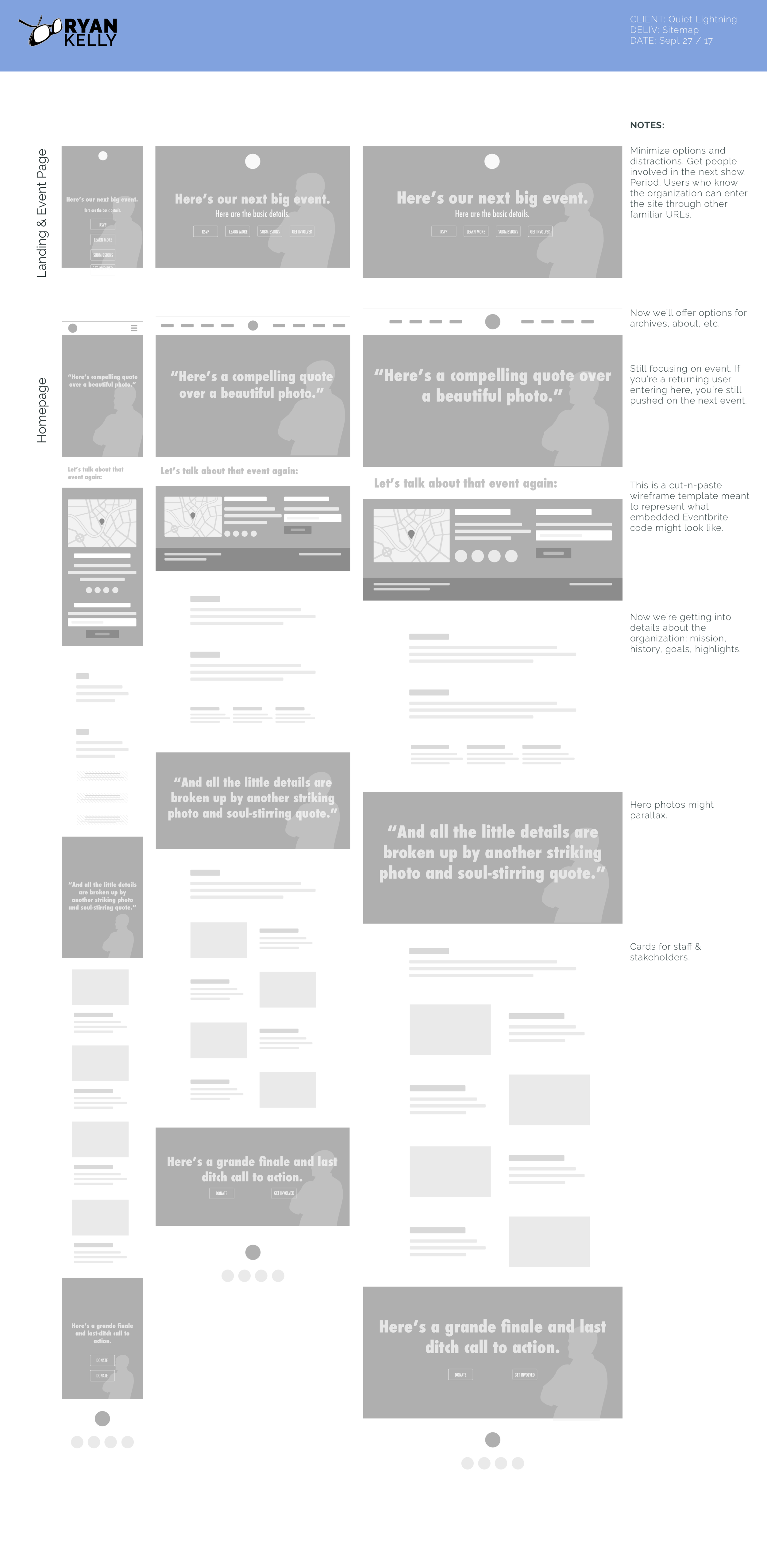
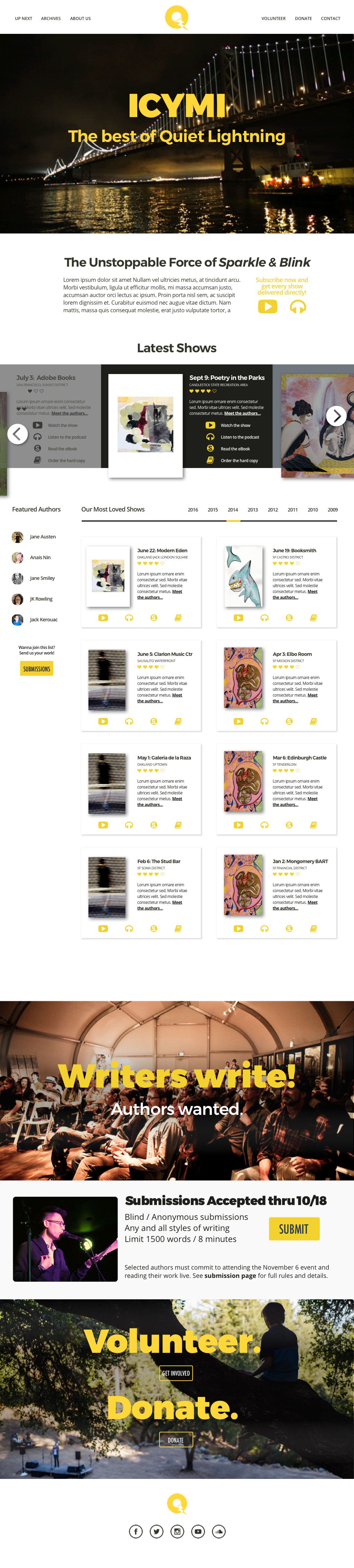
DESIGNING: Wireframes, Branding & Style
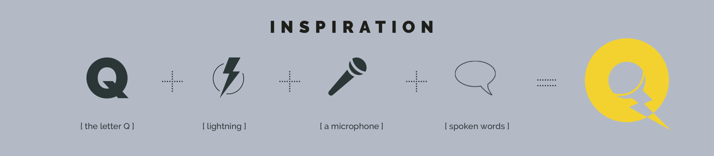
Maybe there was something literary and deco about the current logo, but it wasn't well received, and didn't translate to the web, mobile or social well. The logo needed a strong refresh that promised to take the whole visual design with it. The letter Q and lightning imagery design themselves, and it evolved from there.
Wireframes
Big photos and big words. Here's what's happening and here's where it's happening. I framed the site out dead simple. I screamed it. I said it again softer with more detail. Then I kept saying it. Even when delivering secondary information, it was in terms of how it makes the next show matter. STAY ON MESSAGE.
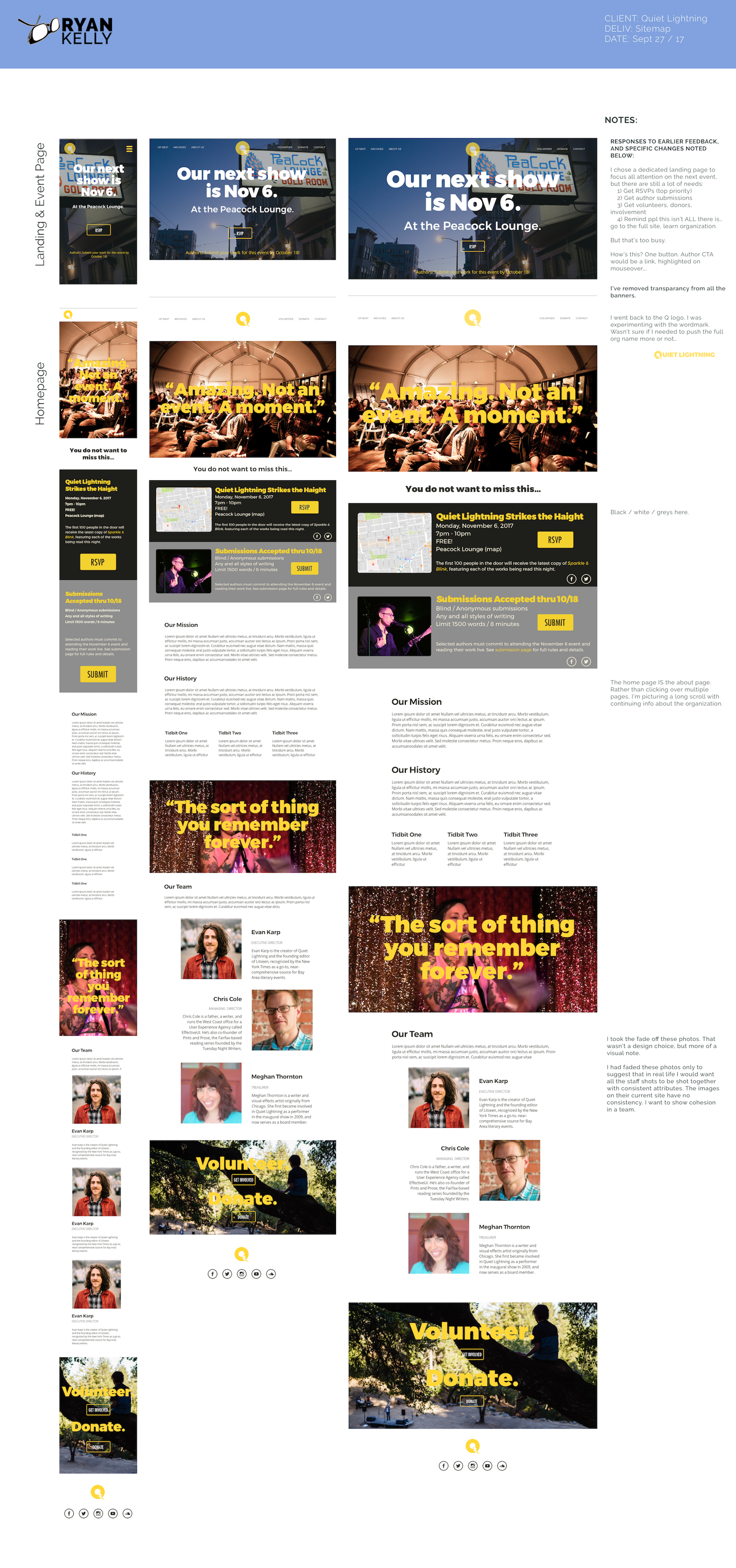
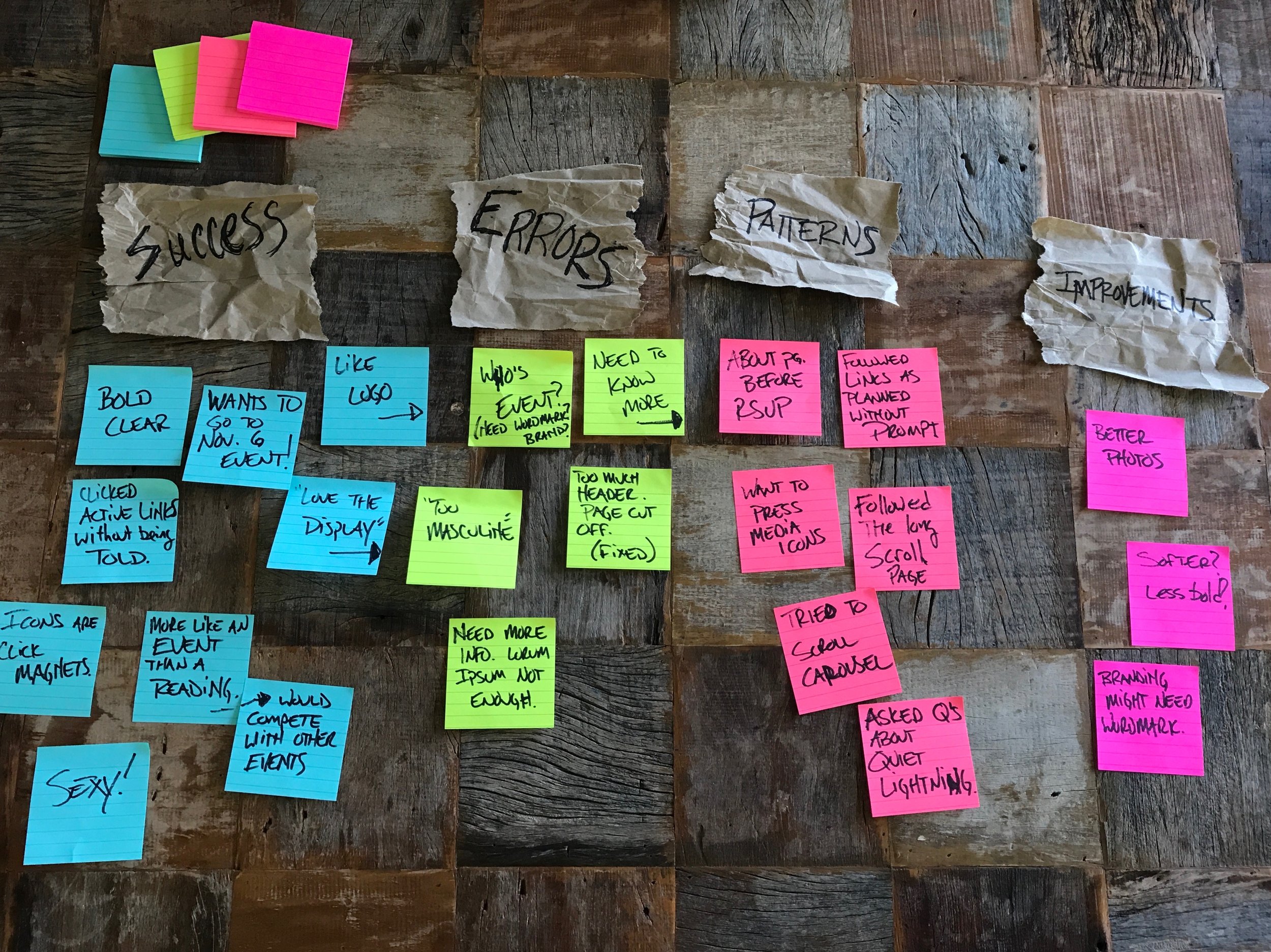
DELIVERING: Prototypes & User Testing
InVision prototype testing went as expected. Users were not specifically asked to walk through the mapped user flow. Yet without prompts, all found their way through the RSVP path, to the About homepage, and to the archives. Feedback was mostly positive (many had seen the "before" site). Users were all active San Francisco residents, who expressed a real interest in attending the next Quiet Lightning show.
Conclusion
I've written earlier about a hypothetical project that led to waaayyyy too much overthinking. Here I had a real project that I needed to force-think about, as my gut really wanted to just design around "obvious" assumptions. And yet, most of those assumptions proved valid, and the design went forward as imagined.
The ultimate takeaway here is that almost any endeavor -- particularly a non-profit organization -- is driven by the labor of love and passions of those supporting it. As a UX designer, learning those people is exponentially more important that learning the project mechanically. If you can bottle their energy and enthusiasm into an experience, the design will win.