The Surrealist’s Beer
Son of Hop’s journey through SFMOMA, TIME Magazine and the California State Fair

What’s a Grissette, Anyway?
The beer style was so obscure, we couldn’t even definitively determine if it was spelled with one “s” or two. Grisette? Or Grissette? Google was no help at all.
Nonetheless, we had one on the way. A grissette (there, decided…) is a cousin of the Belgian saison. Saison, of course, translates to “season,” and was traditionally made for fieldworkers kicking back after a day’s harvest — hence the term being synonymous with “farmhouse ale.”
As parts of Belgium became more industrial, the grissette evolved. The lore tells that the heavy work of stone quarries necessitated a lighter, more refreshing, lower ABV drink, which was brewed with malted grain and more hops for added weight and texture, seeing as it would otherwise be watery (add your own Dilly Dilly thought here…). Some say the name — gris = grey — derives from the grey frocks of the servers, others credit the grey stone dust on the workers.
All Everything is Local
So we’ve got this obscure Belgian experiment coming about 6 weeks down the production calendar, when I get an email from an event producer at the San Francisco Museum of Modern Art. “We’re installing our new Magritte exhibit, and are looking for a local brewery to serve at our opening event…PS it would be great if you had something Belgian.”
That’s one of the greatest things about the Bay Area…not only is there usually a great local version of anything you could want, but there’s also hella peer pressure to find it before defaulting to something mass produced. See…just now I considered several words for “a large amount” before realizing I’m obliged to use the local “hella.” SFMOMA could have easily Dilly-Dilly’d, but they came to us.
“Why…what a coincidence…we happen to have a unique Belgian beer releasing that same week!”
Optimization

Success is rarely created from scratch. Rather, it comes from maximizing opportunities that present themselves serendipitously. This was one of those opportunities.
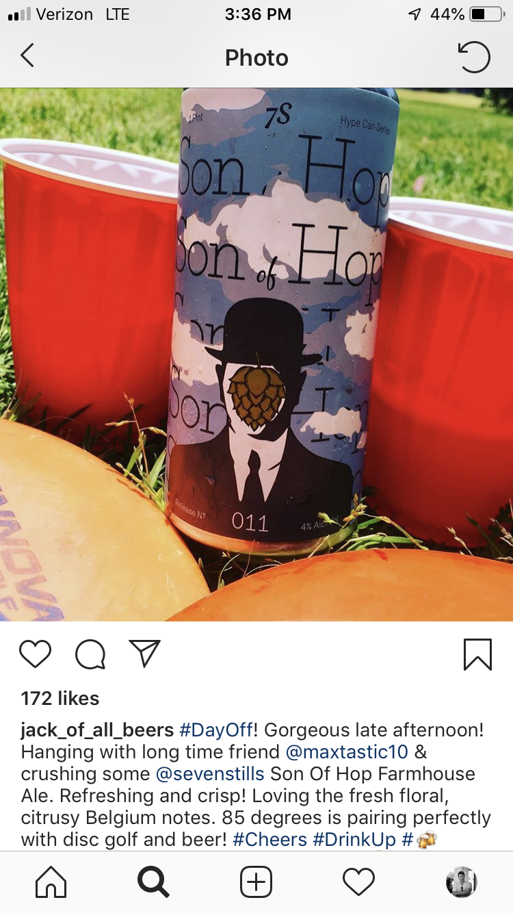
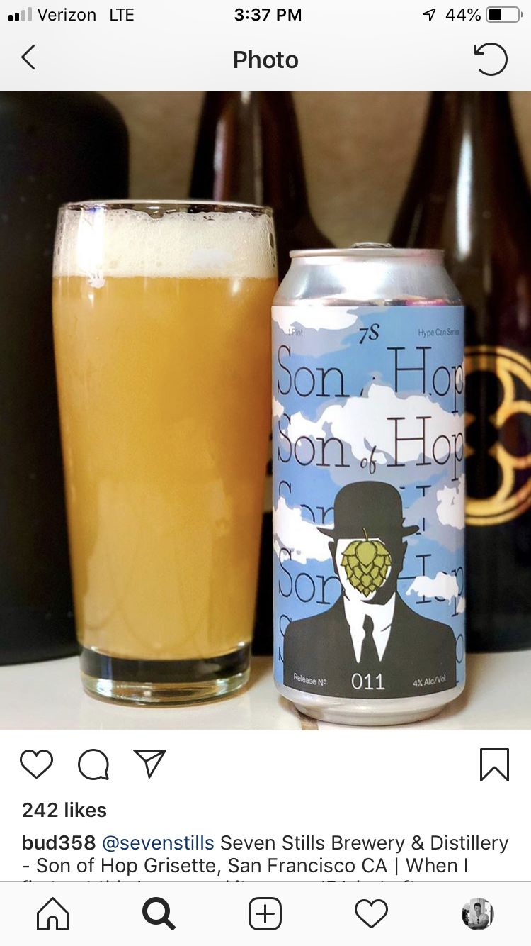
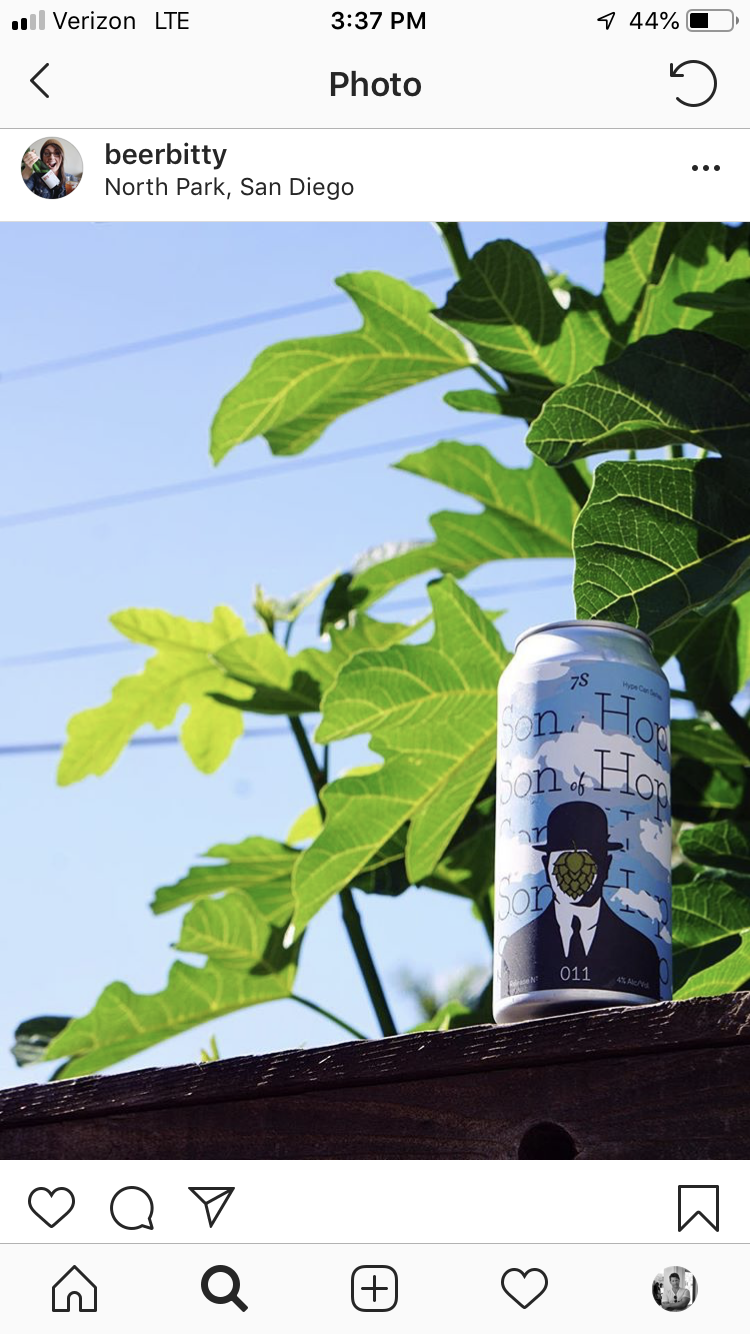
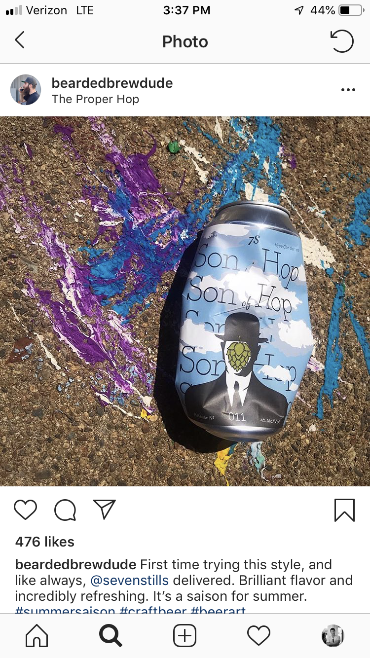
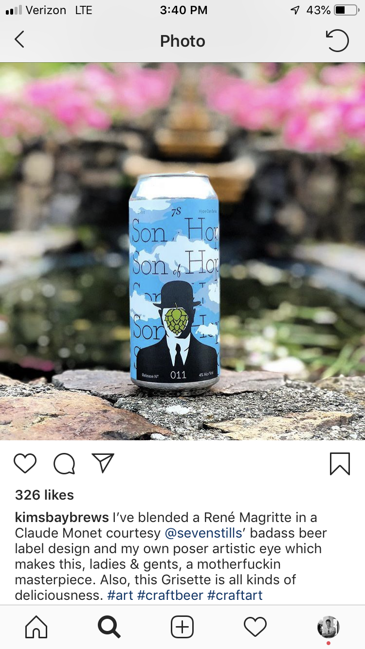
I immediately dove into Google to learn everything I could about Magritte. I wanted to get really clever. But then I recalled the Seven Stills way…blatant rip-offs and ridiculous parodies of the most obvious icons. I came up with the same idea that’s been done a thousand times: a satirical “Son of Man" with hops thrown in. The can and the brand designed themselves.
A Great Product Helps
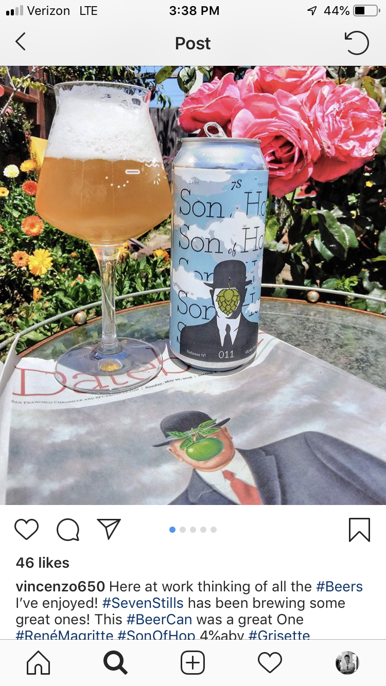
The beer turned out to be fantastic. That’s not always a certainty when working with live yeast cultures that make their own decisions. So we were launching a great product in a fun package that was further validated by our affiliation with the actual artwork. This was marketing synergy at its best, and the public, um…drank it up enthusiastically.
Attention Attracts Attention
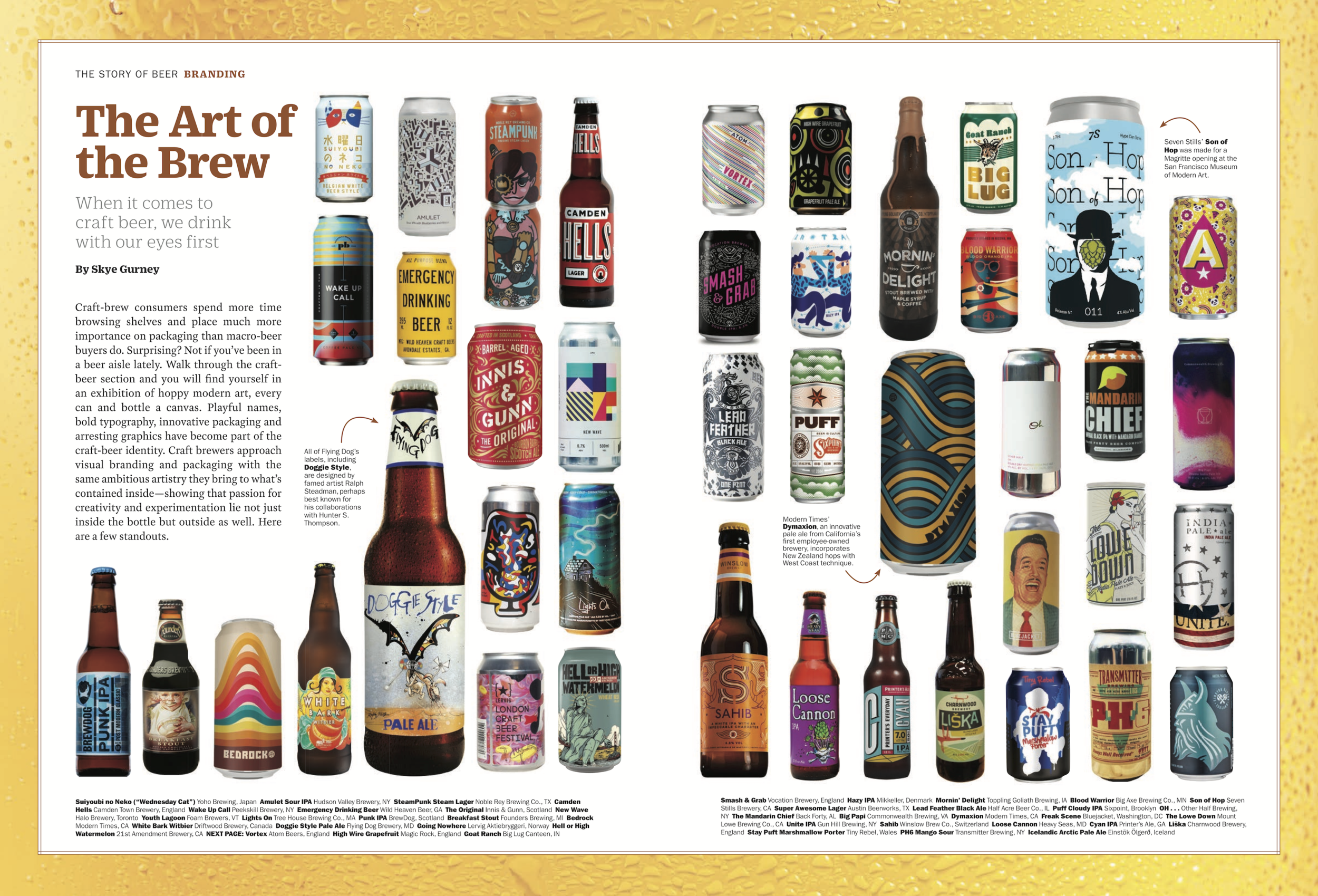
The more people talked about us, the more they talked about us. The buzz around the Son of Hop release peaked when I got us on the radar of TIME Magazine, who featured us in their special edition on craft beer in a spread specifically focusing on the emerging role of packaging design. I keep telling people…Beer cans are the new album art.
Accolades
There are a lot of beer festivals, a few that award the best submissions, and fewer yet that matter. The California State Fair Beer Competition is one of those that matters.
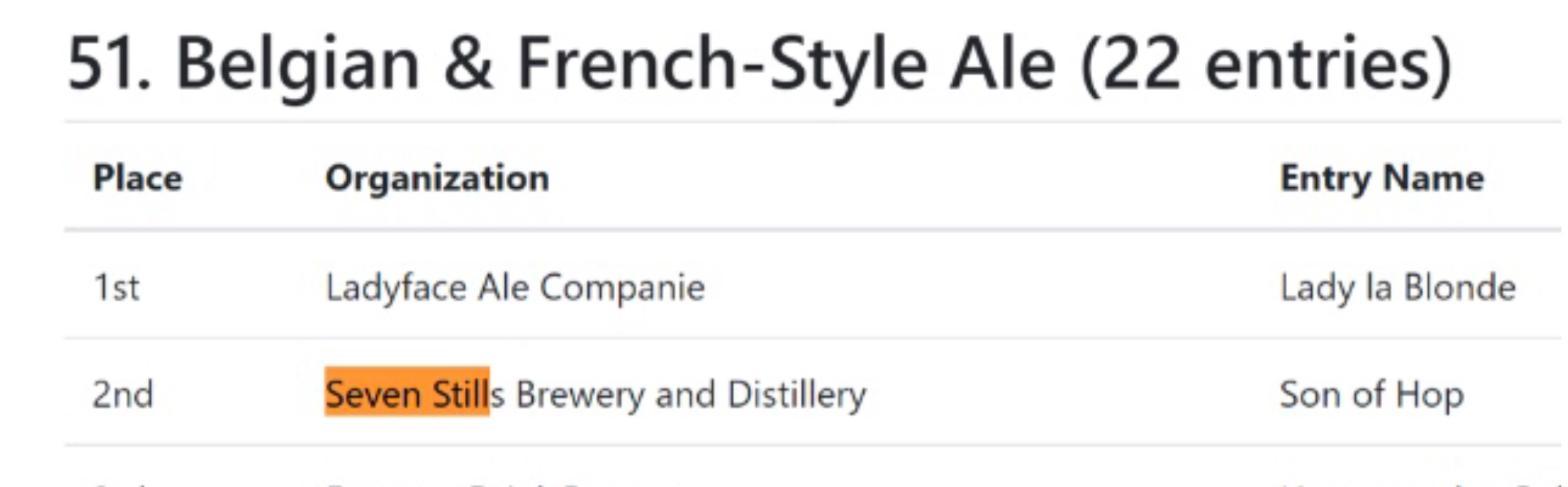
We submitted Son of Hop for consideration there, and while it’s a blind test that brands can’t particularly lobby for, it occurred to me that there might not be many “grissettes” in the field. So I upped the advertising and influencer outreach in the days prior to the competition — and specifically in the Sacramento area — to get any Oscar-worthy “For Your Consideration” help that we could get. Whether it paid off or not…we did win an award. Of the three beers we submitted, Son of Hop placed.
Takeaways
As a case study, the Son of Hop experience underscored what can happen when all elements of a product work together. At the core must be great substance — the actual beer had to be quality. But a lot of great products wallow in obscurity. Here we put it in the right design, with the right brand, marketed it well, connected it to the public creatively, got our public to market it for us, supported it with press, and then landed the affirmation. The campaign ultimately boosted the overarching Seven Stills brand, enhancing the product releases that came after it.